A Forest Tail
Dialogue Update: Portrait location! ( Feedback needed )
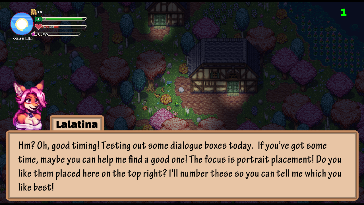
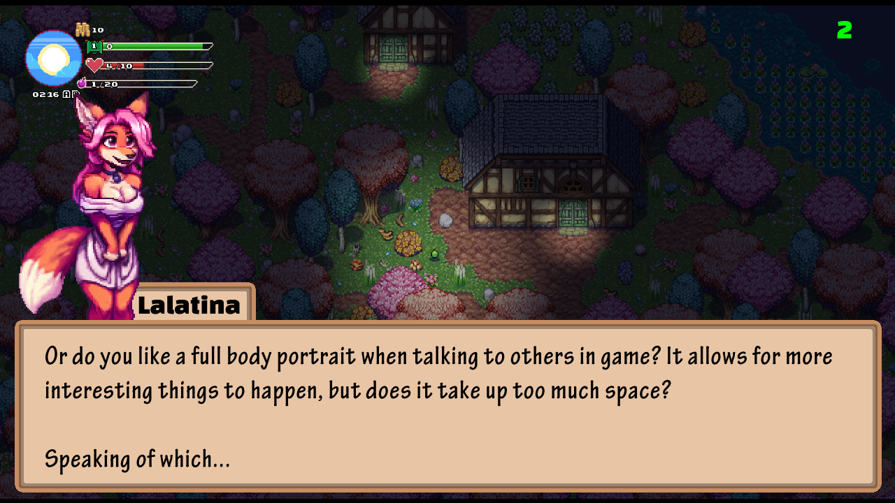
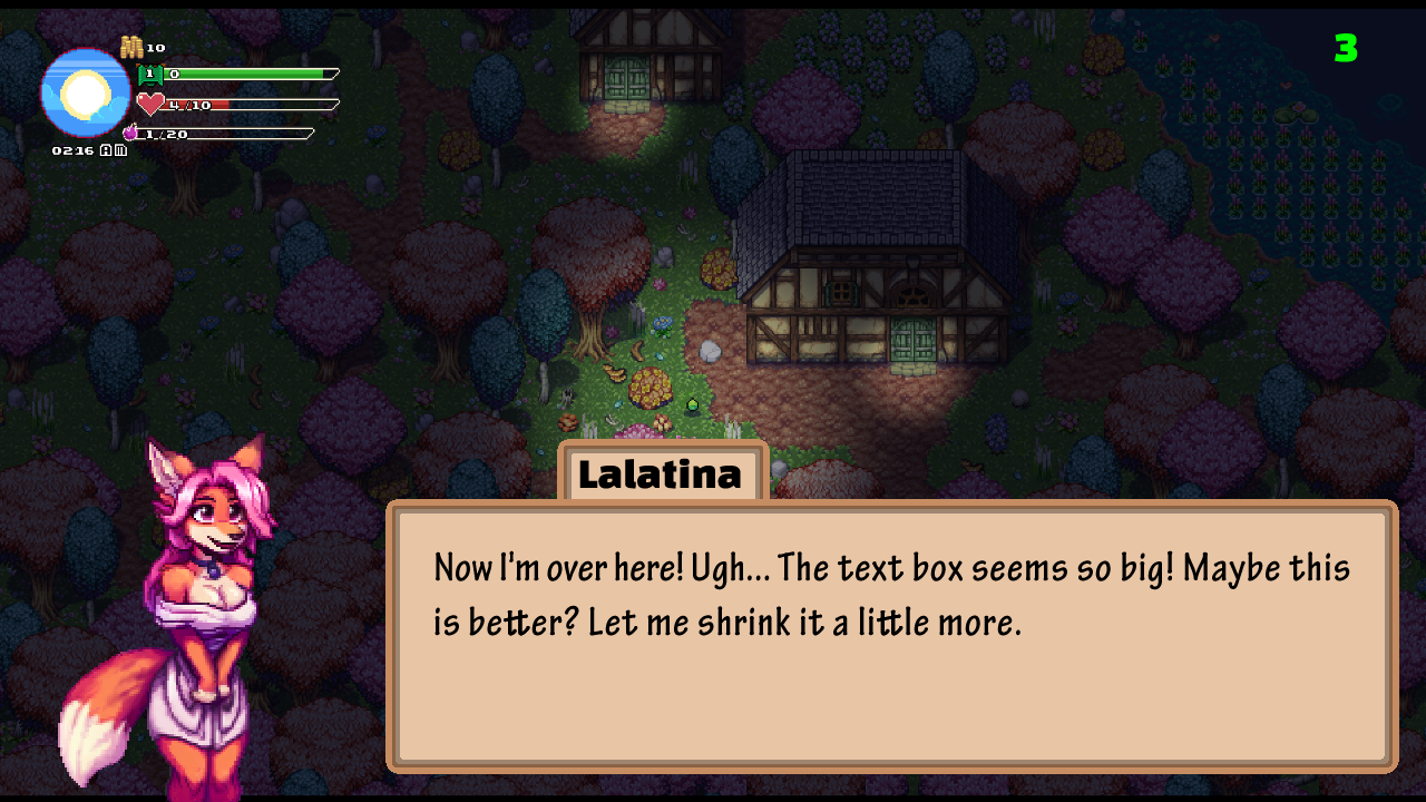


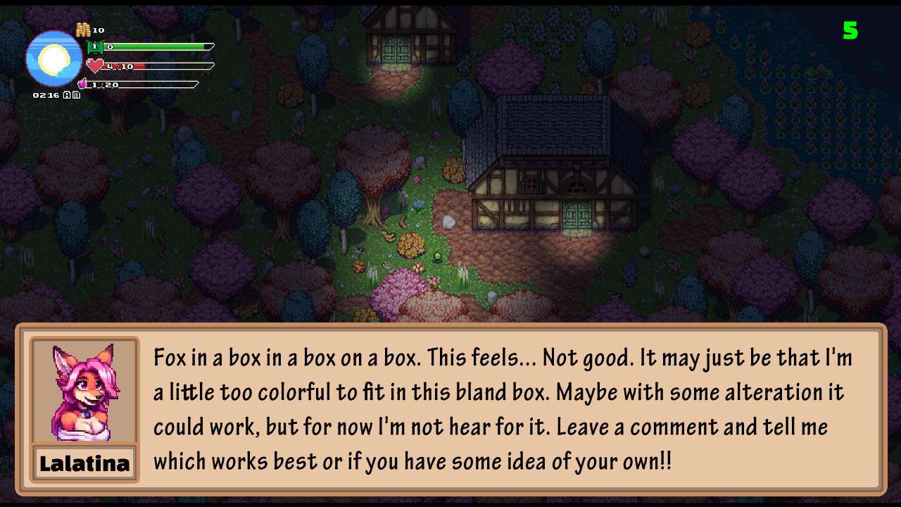
Dialogue is going to be a major portion of A Forest Tail ( ~30% depending on how you play ). We want to get your opinion on what location setup feels most comfortable for you! Made 5 little options here based on other games and just what we think look "normal." Really would love your thoughts on what looks best and even what just doesn't look good. If you have any games that do dialogue and portraits really well, bring it up! Your decisions will help us craft a game you'll be exited to play!!
There's 5 choices, each numbered in the top right of the screen. You may have to scroll / swipe through, but my personal favorite is #4.
Know this: The dialogue box itself is very basic and just being used as a placeholder. It will later be altered to match the pause menu in the current test build you can download. If you have some ideas on that as well, bring them!! Currently we're thinking about changing the UI based on the season and area. Characters in low lighting during the dark and night areas, leaves on the UI for autumn, snow and ice on the UI frame during winter. Comfy things, ya know?
Edit:
Added 4.1 to the list of images above after some great suggestions. Thanks for the help!!
Get A Forest Tail
A Forest Tail
Lewd furry game with monster, furry, human, demon and so much more to romance!
More posts
- Getting back on track now that's school's almost overApr 28, 2025
- Slowly but surely!Mar 31, 2025
- Delays in updatesMar 15, 2025
- A new idea, what do you think?Feb 19, 2025
- Update with actual gameplayFeb 12, 2025
- Stats for nerds - Potentially 256 days until release.Feb 10, 2025
- ( NSFW ) HD art or Pixel art?Feb 06, 2025
- Free month on LalaLewd's PatreonFeb 02, 2025
- New visuals / Steam Page coming soonFeb 01, 2025
Comments
Log in with itch.io to leave a comment.
After looking through them all and reading through the comments already said, I have to say I’m definitely a big fan of the 4.1 version of the textbook and character sprite. In my opinion the others have the the character portrait too small and it seems like with the 4.1 version of it you’ll be able to do more with the sprites like more dynamic poses to accentuate what they’re saying and add to their personality, unlike with the smaller ones or the others that just show their face. Also Id just prefer to see the whole body sprites because your pixel art is amazing!
With the overwhelming response for 4.1, I believe that's what we'll be going with! Though, Foxekai is looking into potentially making a modular UI that can be adjusted in game to the player's liking, so that could fun, too! For now, though, 4.1 checks all the boxes! Thank you!! Pixel art is challenging, but when done right, it's so cute! Now I just need to make the 112+ characters in the game and all their expressions...
I think adding face portraits (only the face, big and clear on the left side of the box) is easy enough to apply so I go for them. But then, you can add the option for the players to turn on and off a full body portrait (if you ever add clothing mechanic to the game this allows the players to take full advantage of the a full body portrait too).
And as for what version of the full body I like... I think a slighty different version 4 is the best. Make the character bigger and keep the chatbox that size, I don't know if it would be too much of a hassle, but add the character in a way they cover juuuust a bit of the side of chatbox, in my opinion it makes the dialogues more pleasing to look at, plus it makes the character seem more alive as it is interacting with the chatbox.
There's most certainly going to be portraits with changes depending on the events going on, so full body will be best. As for the idea you have, is this what you meant?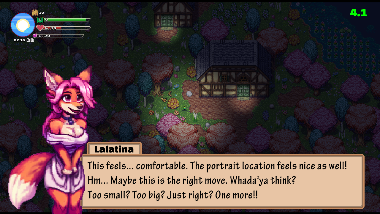
Yeah this has my vote, you should add it to the list
Exactly so. For me this is perfection in terms of a full body portrait, it may be difficult for some characters to fit in this style but this way the main attention of the player is going to be drawn to the character's appearance first since it is 'in front' of the chatbox, which is the whole point of having a full body portrait on display. That's at least how I look at the portrait when it's presented this way.
This is quite stupid or presumptious of me, but why not add all and let the players choose whatever they want? Its a lot of work yes but, having options and being able to change it on the go is good. Well for me at least
that would indeed be hella work, but it's not impossible. this is pretty good and I'm going to keep in mind for when we finish the main sets and go through the polish phase on the dialogue.
Never feel stupid!! Your feedback is golden! If Foxekai can manage that, it would be such a cute option to move the UI elements around to whatever the player likes!
Just my thought pattern but here goes:
Option 1 - works well if all we're gonna have is conversations with only the upper body making gestures to depict emotions/moods.
Option 2 - gives more room for full body expressions. if something is supposed to be happening in the background during the conversation, then there is a possibility of missing portions of it depending on location.
Option 3 - is more spaced out but the text box may be taking up most of the focus due to its bigger size.
Option 4 - has the best spacing and size comparison between the portrait and the text box, which still allows you to view the full body expressions without much issue.
Option 5 - pretty standard stardew fashion. it would definitely limit your expressions to facials only in order to fit the portrait box but is overall pretty basic in comparison to the others.
Overall, I'd have to go with options 2 or 4 as the best out of the 5.
This is brilliant information to digest. thanks again for being detailed with this stuff. I'm on the side of 4 being the best option overall as well. I'm looking at 2 again and I could see it being good if I do some tweaking to how it all meshes.
After some suggestions about the character size, we came up with this. Does it change your choice?
I'm very much ok with this size choice. Well done.
Perfect! Then 4.1 it will be! Time to move onto the next step of making ever character!!
in order of preference:
Like- 4 1 3 5 2 -dislike.
i just thought about it, but i should add transparency to the background of the text box. I should also get the design for the box finished. and do my history quiz. pain.